

Empower hospital bracelet and portal
role
student designer
duration
3 months
background
the average ER visit lasts multiple hours and is stressful
team
Ashley Darling
Kate Sheridan
Callie Rigsbee
Cognizant (Sponsor)
skills/tools
user research
ux design
Figma
Fusion 360
objective
reimagine an aspect of the ER to give patients an overall better experience
solution: reduce uncertainty, empower patients
provider portal
provider portal
patient portal
patient portal
NFC hospital bracelet

NFC tag removal

Empower hospital bracelet and dual patient/provider portals utilize NFC tags to allow for patients to have access to their current visit's records, and improve the flow of information between providers and patients.

use storyboard
01
define
user personas


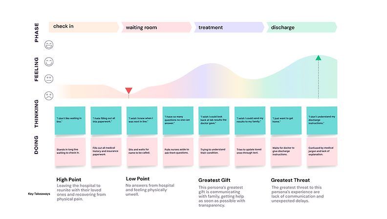
journey map: "waiting is the hardest part"

insights
uncertainty | 1
unclear progress updates: what am I waiting on? what's the next step?
lack of medical knowledge | 2
confusing medical jargon causes stress for patients
non-intuitive process | 3
magnified emotions | 4
work interruptions | 5
if you've never been to the ER, how do you know what to do?
waiting room is filled with other sick people, magnifying pain and stress
providers are pulled away from duties to update patients and family members
02
ideate
design criteria
must have
-
safety (HIPAA, hospital regulations, building codes)
-
easy to clean/hard to disrupt or vandalize
-
makes nurses jobs easier (their time used more wisely)
-
easy to navigate for providers and patients
-
room for a crash cart/vital cart to move
should have
would be nice to have
-
non-throwable
-
modular waiting area
-
warm and inviting
-
sustainable
-
easily implemented into hospitals that already exist (adaptable)
-
educational content to encourage patients to self-evaluate
-
signage and wayfinding, reference/directions to closest cafe
-
warm lighting
-
charging stations, TVs
morphological matrix

The first 100 sketches we did.

The second 100 sketches we did. We begin to group them by theme.

This is our second morphological matrix, a different format than the first and using different themes and ideas.

The first 100 sketches we did.

matrix groups
-
information
-
buzzers -> tablets
-
accessory/distraction
-
patient comfort
-
patient resources
-
pre check-in
-
tracking patient progress/location
-
tracking patient health/well-being
-
check-in efficiency
-
physical Layout
-
telehealth
-
UI and wireframes
-
paired communicators
03
prototype
physical prototype
We adapted the mechanism from clothing security tags, and started by breaking one open to dissect.


Below is the first iteration of the CAD models for our tag casing, as we teased out sizing how everything would fit. We printed this model and tested using the NFC tag to pull up our portal, and practiced removing it with a magnet.


branding


digital prototype
initial: patient portal
secondary: patient portal


initial: provider portal
secondary: provider portal (detailed view)


04
final products + evaluate
patient portal
provider portal
hospital bracelet

tag removal
